Colour is more than just a visual sensation; it’s a powerful force that subtly shapes our moods, behaviours, and even our subconscious thoughts. From the vibrant hues that invigorate us to the soothing shades that calm our minds, colour holds an undeniable influence over our experiences.
Science of colour psychology
Colours aren’t just visual experiences—they’re processed by our brain in ways that influence our emotions and behaviours. Each colour has its own wavelength, which interacts with our brain and body, triggering different responses. For example, colours like red and yellow have longer wavelengths, which can increase heart rates and signal alertness, while colours like blue and green have shorter wavelengths, promoting calm and relaxation.
This response is partly biological. Our brains associate certain colours with specific emotional triggers based on evolutionary survival instincts. For instance, red is often linked to danger or urgency, which explains why it can increase our stress or energy levels. Blue, on the other hand, is associated with the sky and calm waters, triggering feelings of serenity and focus.
Cultural associations also play a significant role in how we perceive colours. While white may symbolise purity in Western cultures, it represents mourning in some Eastern traditions. These varying meanings can change how we emotionally respond to a colour, depending on our cultural background.
The mood palette: How colours affect emotions
-
Red: Evokes energy and passion but can also trigger aggression. Often used in fast food branding for stimulation.
-
Blue: Promotes calmness, trust, and productivity, making it popular in offices and hospitals.
-
Yellow: Represents optimism and warmth but can cause anxiety if overused.
-
Green: Associated with relaxation, harmony, and nature, promoting balance and renewal.
-
Purple: Linked to creativity, luxury, and spirituality, often used to inspire deep thinking.
-
Black/White/Grey: Neutral tones with strong meanings—black for power, white for purity, and grey for neutrality.
Colour in everyday life
-
Marketing & advertising: Colours are powerful marketing tools. Red evokes urgency (think “sale” signs), green signifies eco-friendliness, and blue conveys trust (often seen in banks and healthcare). Examples like red for Coca-Cola’s energy or green for Starbucks’ environmental focus.
-
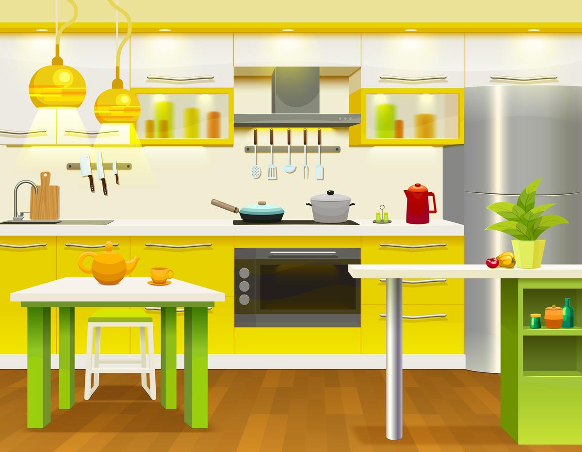
Interior design: Colour choices drastically impact the feel of a space. Calming blues are ideal for bedrooms, while energising yellows are perfect for kitchens.
-
Art & creativity: Artists use colour to evoke emotions and tell stories. Think of the vibrant hues of an Impressionist painting or the sombre tones of a Gothic masterpiece.
-
Therapy: Colour therapy utilises colours to influence mood and well-being. Techniques may involve coloured lights, visualisations, or even wearing specific colours.

Busting myth
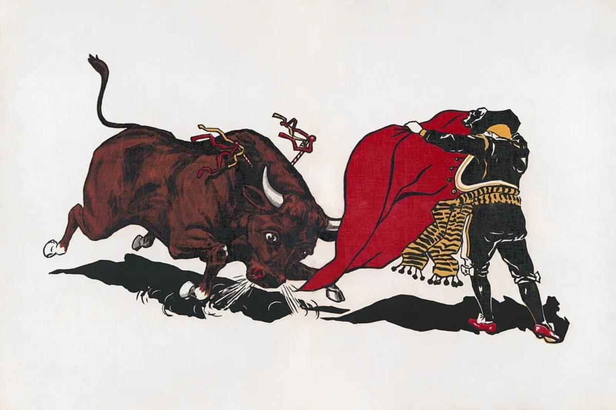
Does red really make bulls angry? No— It’s the movement of the muleta (the red cape) that provokes them, not the colour. In fact bulls are colour blind to red!
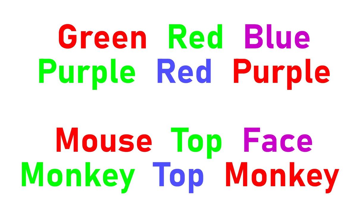
The Stroop effect
This psychological phenomenon demonstrates how colour affects the way we think. If you see a word like “blue” written in red ink and are asked to name the ink colour, it takes longer and is harder if the word and colour don’t match. This happens because reading words is an automatic process, but identifying colours requires conscious effort, showcasing how colours can influence mental tasks.
Colourful facts
Colour and appetite
Colours like red and yellow are commonly used in fast-food logos to stimulate appetite and evoke happiness, while blue, a rarity in natural foods, is thought to suppress appetite and is avoided in dining settings.
Purple’s royal origins
In ancient times, purple dye was so expensive that it became a symbol of wealth and royalty.
Green room calm
The term “green room” in theatres comes from the belief that green helps relax performers before going on stage.
Orange for attention
Orange is used for safety vests and traffic cones because it grabs attention and is highly visible.
Pink for sportsmanship
The visiting team’s locker room at Iowa’s Kinnick Stadium is painted pink to reduce aggression and promote calmness.
Yellow’s dual power
Yellow boosts memory and concentration, making it ideal for legal pads and sticky notes, but it’s also a warning colour for signs and signals due to its high visibility.
Black and luxury
Black conveys sophistication and luxury, often featured in high-end fashion brands and luxury cars.
Green for eye comfort
Green is easy for the human eye to focus on, which is why it’s used in computer screens to reduce eye strain.

Did you know
The blue light from screens can keep you alert but make it harder to sleep? This happens because it mimics daylight, tricking your brain into thinking it’s daytime, which can make it harder to fall asleep.
Published – March 13, 2025 03:04 pm IST